Paolo's is a new, Italian-inspired restaurant in Brunswick, Maine in the historic Fort Andross Mill.
Paolo's is a new, Italian-inspired restaurant in Brunswick, Maine in the historic Fort Andross Mill.
Paolo's is a new, Italian-inspired restaurant in Brunswick, Maine in the historic Fort Andross Mill.
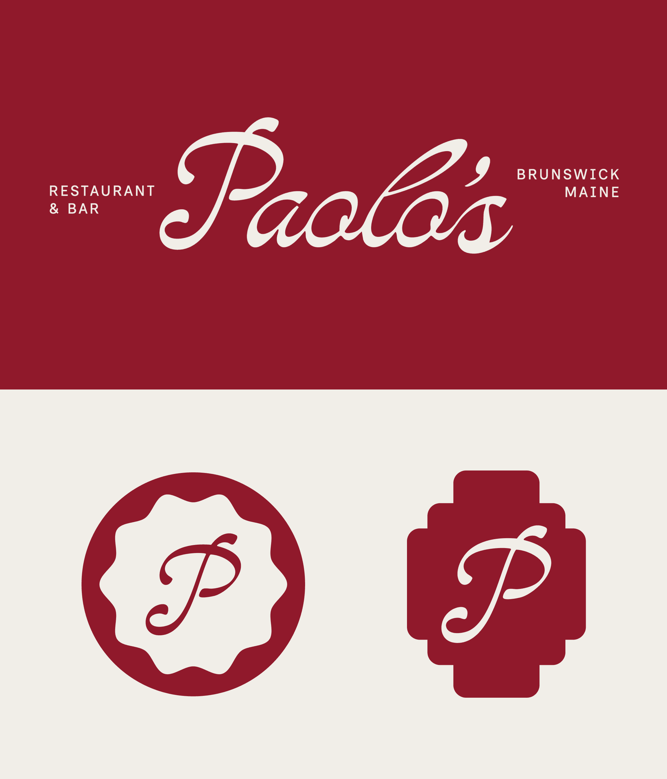
Paolo's was looking for an approachable identity that merged timeless Italian red sauce joints with a modern aesthetic.
The team at Paolo’s also runs Dutchman’s Bagels in the Mill, and were in need of an identity that was complementary yet distinct to their sister restaurant. Our visual identity mixes nostalgia with a cool, contemporary edge. Paolo’s branding is a fresh, bold take on the charm of classic red sauce joints. We used a rich palette of deep reds, warm neutrals, and funky greens that adapts to the cozy vibes of a family-style Italian eatery and the buzz of a packed dining room.
The wordmark and typography system stems from vintage signage, family heirlooms, and historic tri-state (New Jersey, New York, and Pennsylvania) staples that paved the way for Italian-American dining to create a identity that’s timeless yet totally “now” and a love letter to the unshakable spirit of Italian-American dining.
Deliverables
Brand Strategy, Logo System, Brand Illustrations, Menu Design, Merch